Graphs are essential to any good report and with Google sheets being a hugely popular option for spreadsheets these days, it only makes sense that you would want to know how to integrate graphs into it. This is what we will be talking about in this article.
Step by step tutorial for creating a chart in Google Sheets:
Time needed: 5 minutes.
We will be going through the steps that will allow you to create some awesome graphs, as well as the best ways in which you can optimize your reports to accommodate this need. It makes a lot of sense that you would want to make the best impression when you are conducting your report, so be sure to read everything closely.
-
Open or Create a Google Sheet
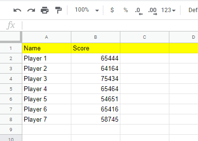
Using a new or an existing Google Sheet, input the relevant details that you are trying to make a graph of. If you already have a vast and complicated report, you can certainly use that. However, if you are not that familiar with this platform yet, it would be best to have a more simplified report with two columns. One will be for the subject and the other will be for the figures.
-
Select insert chart
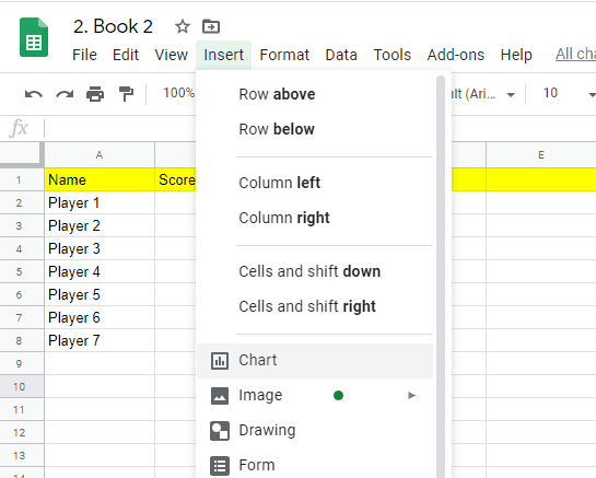
Select the Insert tool on the toolbar and click on the chart command on the dropdown menu.
-
Input Relevant Data
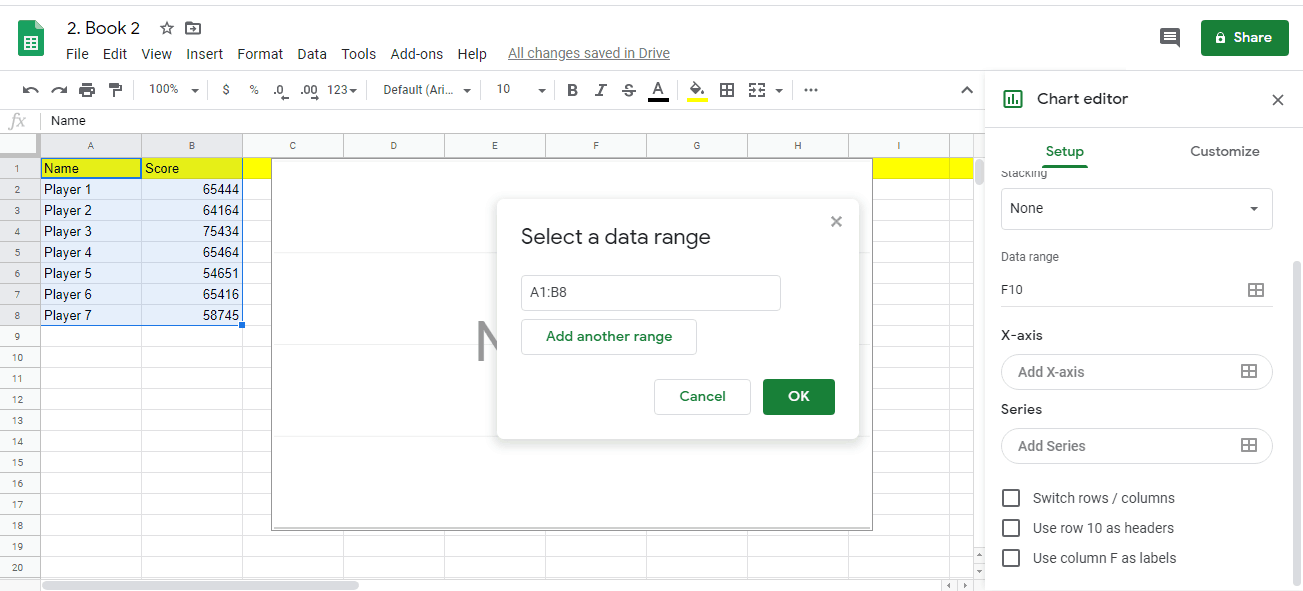
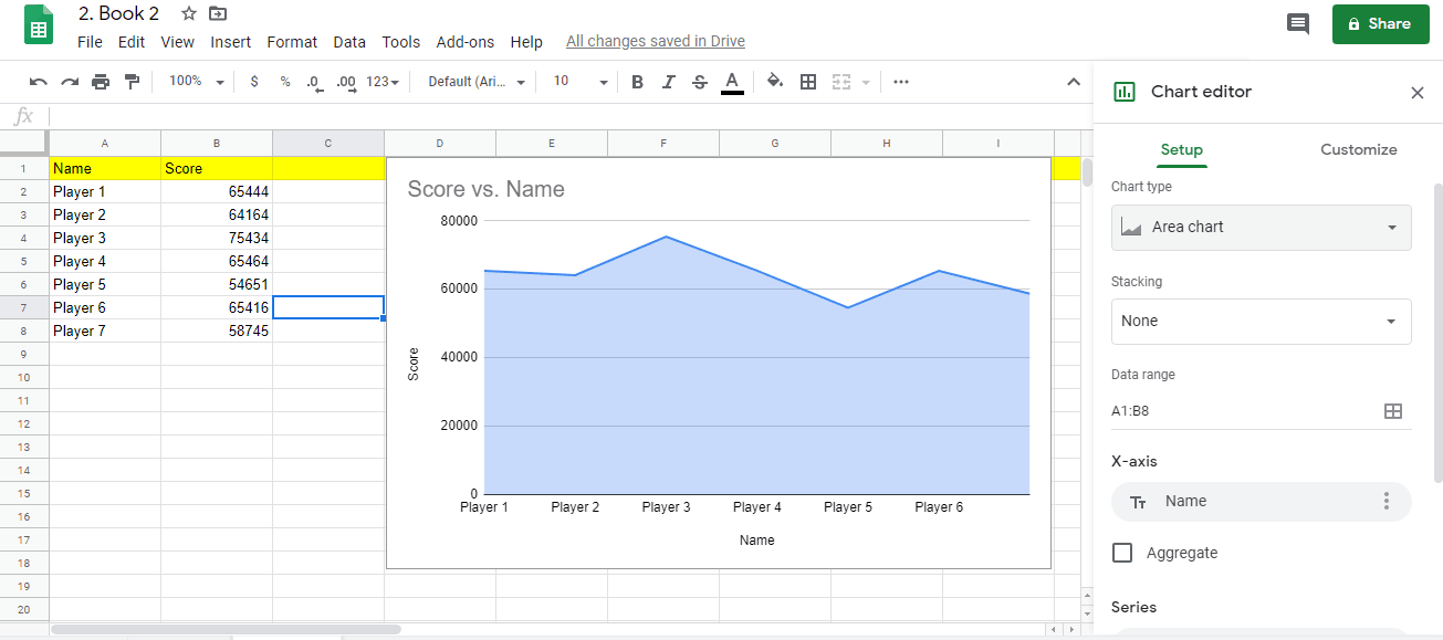
Using the editor tool on the right-hand side of the sheet, input the relevant parameters that will be included in your graph. In this case, we will be highting the two columns and all of the filled rows.
-
Check the Graph
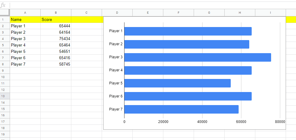
Once you hit the Ok button, you will end up with a graph that looks like the example below.
If you want, though, you can also use the chart editor menu to change how the graph will look. -
Change the type of the chart
If you want, though, you can also use the chart editor menu to change how the graph will look.
So, there you have it. You now know how to create an excellent graph when you are using Google Sheet. Using this same method, you can actually also create charts of different shapes and colors.
A graph is basically a visual representation of parameters that typically involve figures that correspond to particular subjects or items. It is often also referred to as a chart, though, there are some start differences between these two visualizations. To start with, there is the matter of shape and typical use.
Charts are often favored more for abstract or broader concepts rather than meticulous, specific details that deal with the minutiae of factors and figures. To put this in context, you can take into consideration such things as age, population, and average lifespans when using a chart.
These types of visual representations are meant to convey a sense of awe and to impress the audience. It is not necessarily about informing them.
On the other hand, you can take specific individuals and their work performance right down to the decimals when you are using graphs. This is why you would often find graphs used in presentations for quarterly financial reports or by scientific studies and surveys.
The graphics are basically meant to educate the audience and let them know exactly what they are dealing with. This is important when trying to bring in more money from investors and the like.
You might think that a very detailed spreadsheet is already enough to make your presentation impressive, but while there is certainly value to well-filled rows and columns, they are often not enough. To really impress upon your audience just how awesome you are doing, you need graphs.
A lot of this has to do with the tendency of the human brain to zone out whenever numbers start hitting several digits, especially when there are decimals involved. Having to focus on all those cells with designated figures can be quite taxing on the mind.
Your audience would need to concentrate really hard in order to understand exactly what it is they are looking at.
On the other hand, if you have graphs, the impact is different. Seeing all of those bars just zipping sideways or upwards has a much different effect compared to mere numbers and letters. Even if the differences between the given figures are not that huge, just the presence of the graph automatically makes your presentation seem more credible.
While this may seem a little questionable, there is also the matter of visual trickery in the inclusion of graphs. Simply put, it takes a longer time for the implications of particular figures to really sink in if they are presented as graphs. Numbers are serious and grating, while graphs have more gravitas and mystique.
You might think that since you are dealing with graphs here, why not just use other types of spreadsheets for your troubles? Why would you use Google Sheets specifically for this task? Well, there are a lot of advantages that come with using this particular option.
To start with, you can access it from practically any device in any location in the world as long as there is an internet connection. You won’t necessarily need to bring your own device, either, since you can just borrow from someone else. Of course, it is always advisable for you to bring your own gadget, but it’s always nice to have options.
Then there is the matter of being able to share access to the spreadsheet. If this is a collaborative work, then it makes sense that you would want the people you are working with to be able to access the document any time.
This saves you a lot of time and effort because now, they don’t need to ask for permission whenever they have to make changes or do their job. In cases where you divided the responsibilities, this makes the work a lot more efficient.
